


Design with heart.
Bold & strategic design solutions for progressive organizations, non-profits and changemakers.
Art Direction
•
Branding
•
Campaigns
•
Art Direction • Branding • Campaigns •


Hi, I'm Shannon.
I love working with innovative, progressive people and organizations to create memorable brands, exciting campaigns and efficient design solutions.
Creating visually appealing products with meaning is my favourite thing to do.
Now offering art direction and mentorship •
Reach out!
Now offering art direction and mentorship • Reach out!

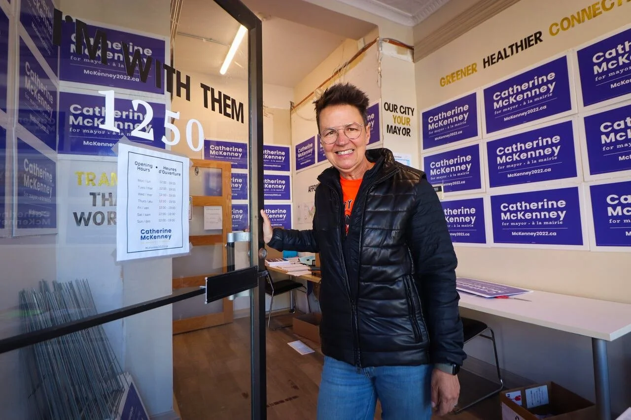
CATHERINE MCKENNEY FOR MAYOR
As Art Director, I created a cohesive brand identity for Catherine McKenney’s 2022 mayoral campaign: clean, modern, inclusive, and deeply tied to community values. The engagement strategy leaned heavily on authenticity, grassroots energy, and a strong digital presence. Even though the campaign didn’t secure the mayorship, the brand and engagement model reshaped expectations for progressive political campaigns in Ottawa and left a lasting imprint on the city’s political discourse.
McKenney’s supporters were highly energized and organized around:
Door-to-door canvassing
Volunteer-driven social media amplification
Community events and neighbourhood walk-arounds
Engaging tools such as GIFs, stickers and neighbourhood signs
Supporters often created their own content like art and videos demonstrating a brand that people felt ownership of.

PUBLIC SERVICE ALLIANCE OF CANADA
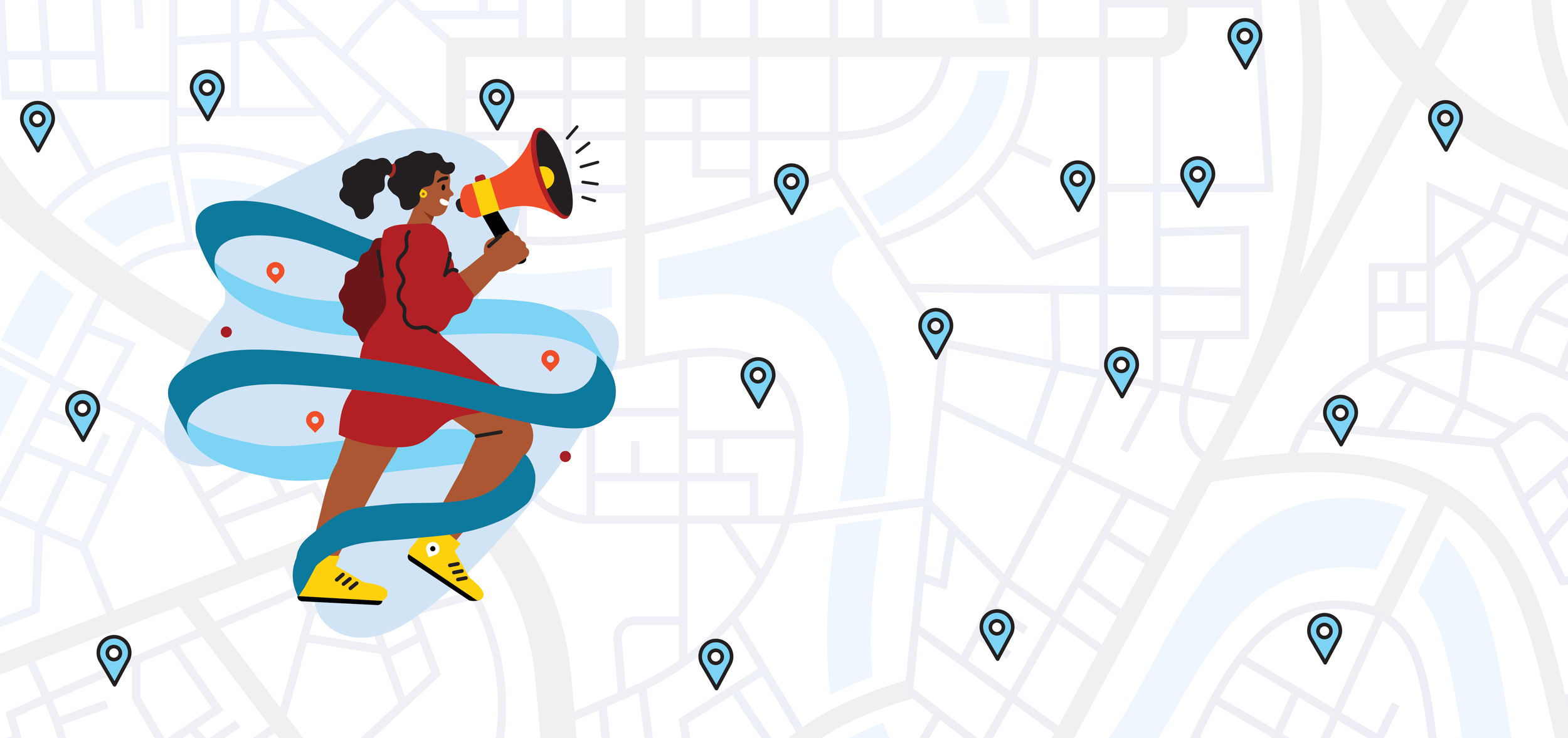
The April 19 strike, driven by more than 155,000 PSAC members, was strengthened by a cohesive visual brand and thoughtful graphic design — most notably through the picket line finder tool. PSAC’s established strike branding, built around bold typography, high-contrast colours, and clear visual hierarchy, carried seamlessly into the digital experience. The tool’s clean layout, simple postal-code search, and unmistakably PSAC-branded interface made it easy to navigate while reinforcing a unified movement identity. Consistent use of colour, iconography, and accessible design elements helped members instantly recognize official information, building trust and reducing confusion during a fast-moving national strike. By blending strong graphic design with functional UX, the picket line finder became more than a map — it was a branded organizing hub that visually communicated solidarity, clarity, and collective power.
Highlights
WOMEN4GUNCONTROL
The #Women4GunControl campaign unites 32 feminist organizations under a bold, unmistakably advocacy-driven brand that frames gun control as a women’s safety issue. Its visual identity leans into strong, declarative typography and a palette that blends urgency with empowerment. The campaign’s messaging is clear and uncompromising, centering women’s lived experiences with gun violence and elevating research on femicide and intimate-partner violence. Through open letters, social content, and coalition-driven actions, the campaign positions itself as a unified, credible voice demanding meaningful firearm reform. The brand tone is firm, feminist, and community-powered, making #Women4GunControl instantly recognizable as a movement that stands for safety, justice, and political accountability.

Kind words
Shannon is wonderful to work with. She delivered full campaign graphics on an extremely tight timeline and created a look and feel for our messaging that was very effective. I would definitely recommend working with Shannon!
TIFFANY BUTLER,
Executive Director,
National Association of Women and the Law
Shannon’s design work is simply the best. Her work takes a campaign brand to another level. She can articulate through her art & branding exactly what the eye will see and what will be recalled from simple images that tell a story. In my experience working with Shannon, has helped me to fully appreciate the benefits of expert branding.
CATHERINE MCKENNEY,
Mayoral candidate and
Executive Director of CityShapes


